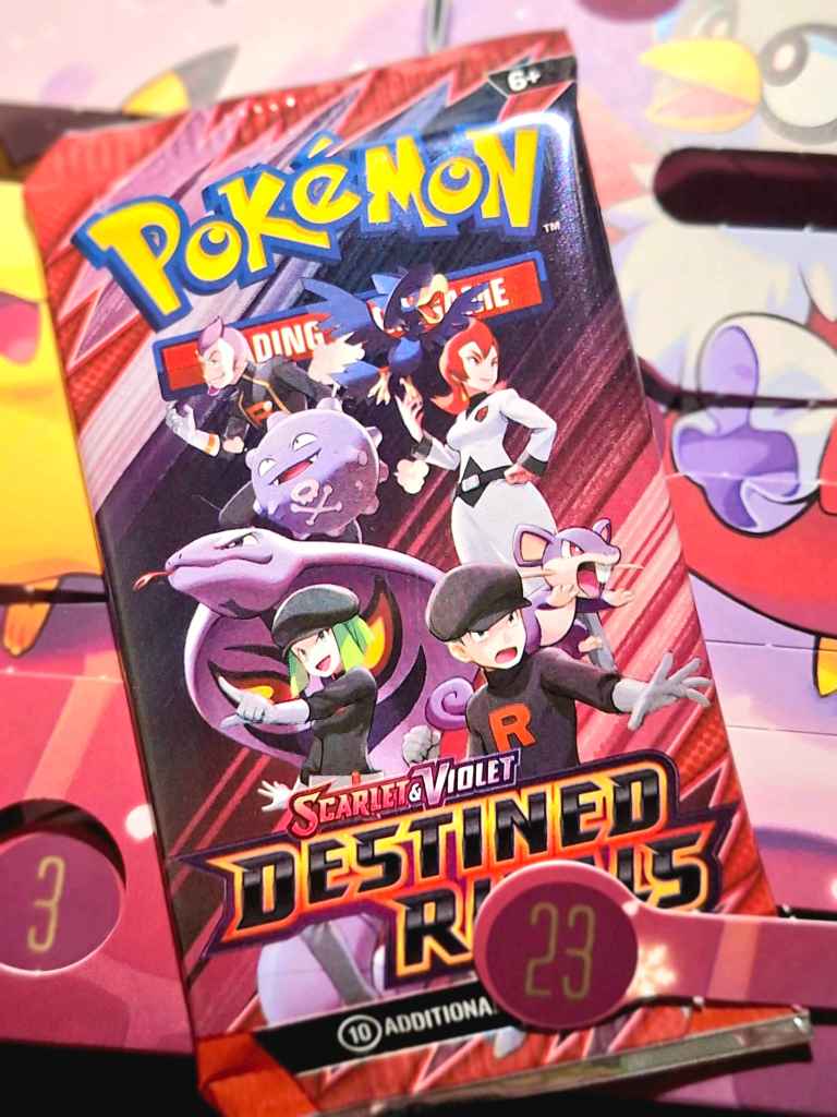
• Our gift for day 23 is a booster pack of Destined Rivals! Let’s pick some cards to focus on.
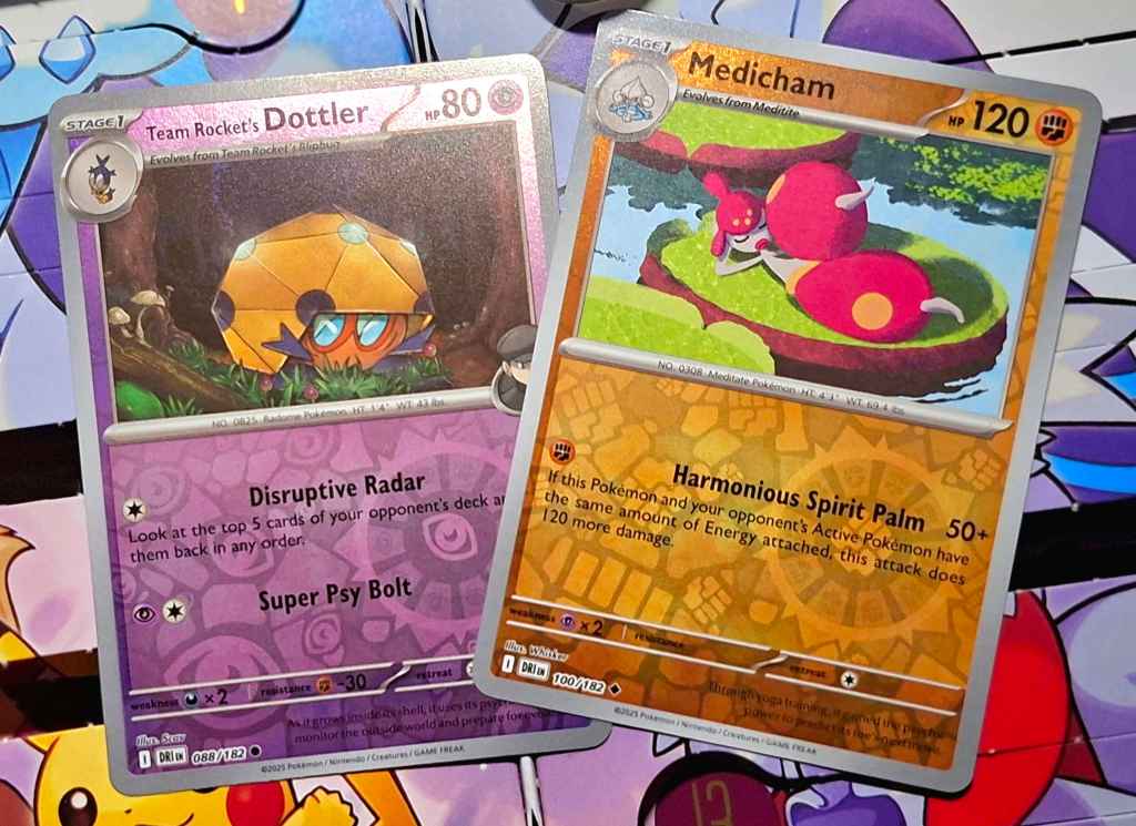
    I picked out these two: Team Rocket’s Dottler by Scav, and Medicham by Whisker. The Dottler, I found interesting for the detail used in the environment around it. By detailing individual blades of grass, ridges on the bark of trees and mushrooms growing on the wood, Scav creates a sense of scale that we subconsciously measure the Dottler against, so it looks small despite filling the center of the image. I also liked the use of purple to light the edges of the trees in the background, which brings to mind the ambient lighting of the night sky. Medicham is almost the opposite; Whisker’s use of a chunky, textured brush gives the lineless style a strong sense of light and environment, from the crumpled suggestion of water plants to the surface of the lilypads to even the dithered edges of the shadows. It feels tactile in a completely different way.
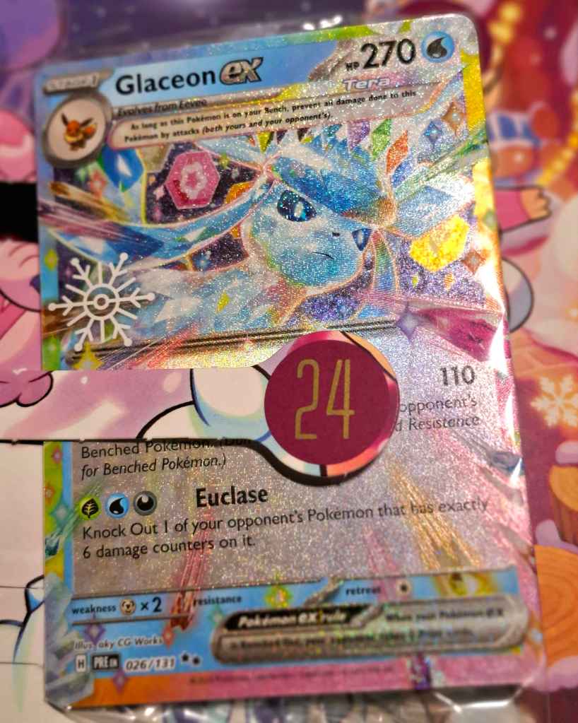
    For day 24, we get this promo card of Glaceon ex! Originally from Prismatic Evolutions, this version comes with a snowflake stamp and some extra sparkly holo!
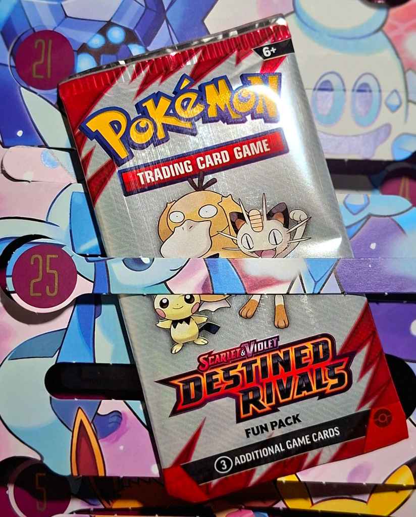
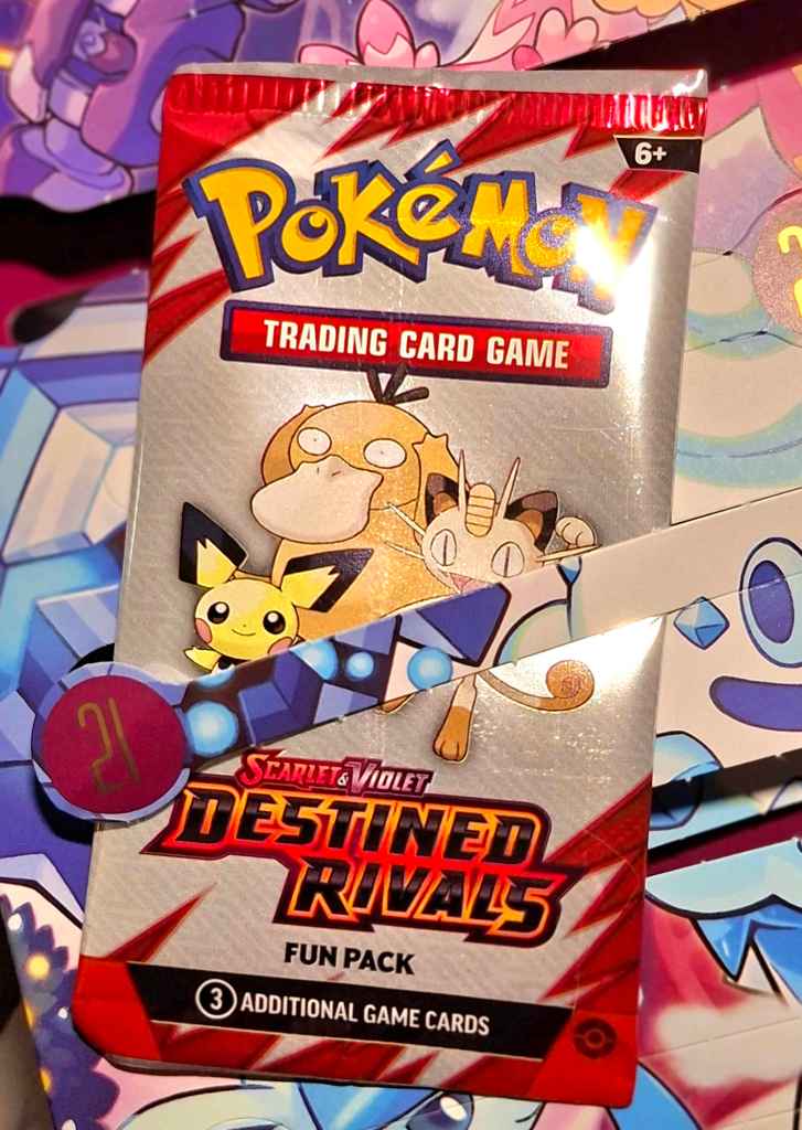
    And our final gift for day 25 is (slightly underwhelmingly) a fun pack of Destined Rivals!
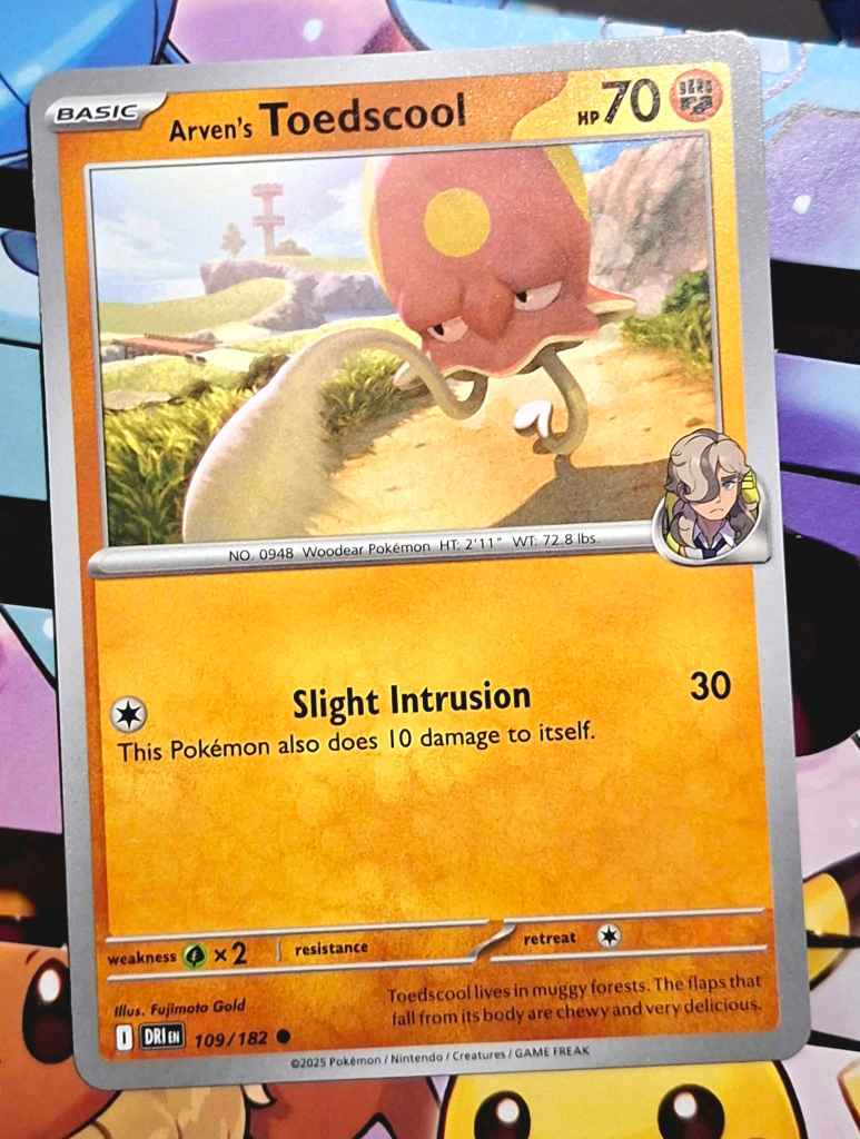
    And for our final card highlight, I chose this Arven’s Toadscool illustrated by Fujimoto Gold! I love the strong lighting in this image, with crisp edges to the shadows and Toedscool itself being backlit, but mostly I love the motion at work here! Toedscool’s running animation has always been just great to me, and seeing it in a static image like this is the result of masterful motion blur and foreshortening. I love it!
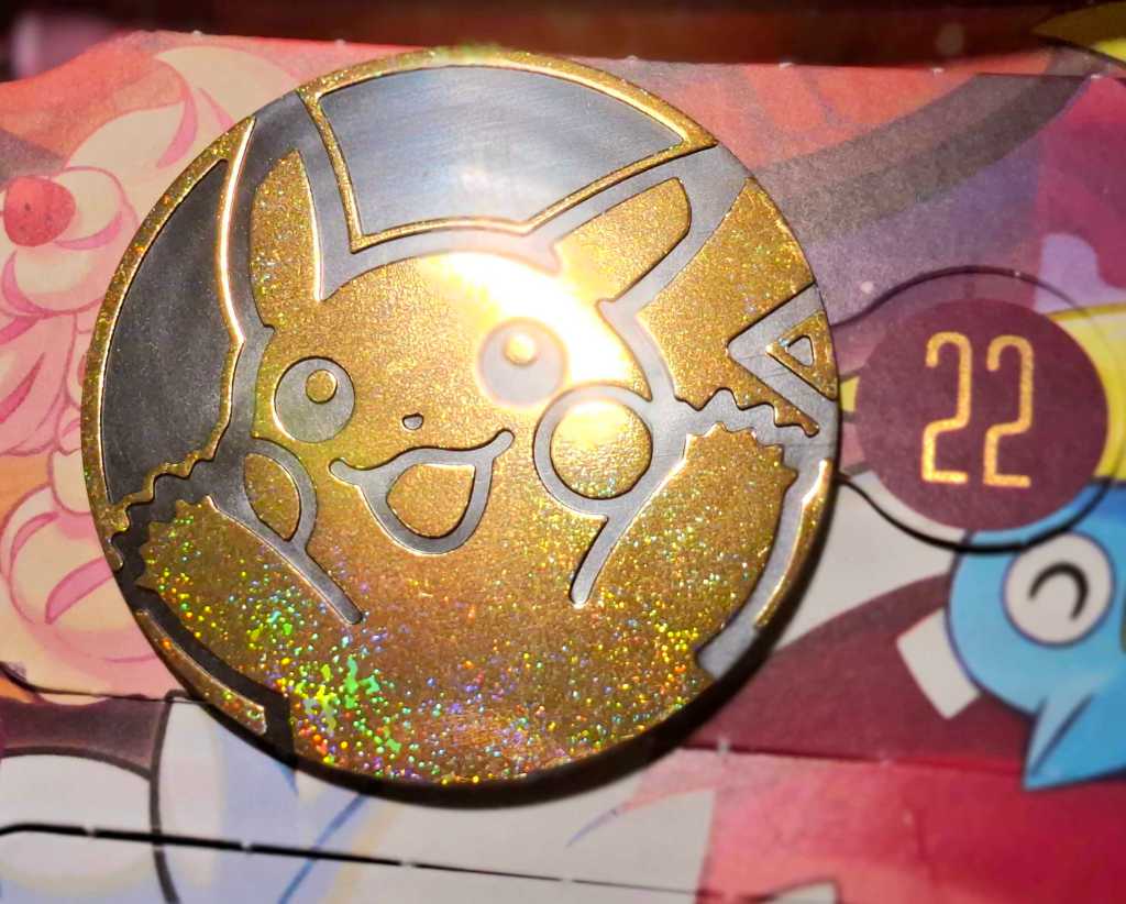
  • Today’s gift was this huge Pikachu play coin, which was so shiny and sparkly it baffled my camera a little! Unlike the Alcremie from earlier in the calendar, this one looks perfect!

    Tomorrow I’ll be combining the last 3 gifts, so it’ll probably be my last post of the year. Although I didn’t start Bear Den TCG until quite late in this year, I hope I can go into the new year with even more Pokémon card art appreciation!

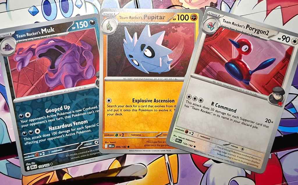
  • Today, we have a fun pack of Destined Rivals!

    Coincidentally, all three cards today are Team Rocket’s Pokémon, with Muk by Uta, Pupitar by Izucch, and Porygon2 by Takeshi Nakamura. Through these cards we can see a great unifying choice in the lighting for this set: Team Rocket’s Pokémon are lit with red lighting and often highlighted from behind! This can be seen clearest with Porygon2, which uses white rim lighting to show the direction of the lighting, but can also be seen in the light edges of Pupitar’s spikes. Being so goopy, Muk is harder to discern, so pay attention to how the red lighting seems to come from above, but a different white lighting is in front and slightly below, lighting up the underside of his right hand!

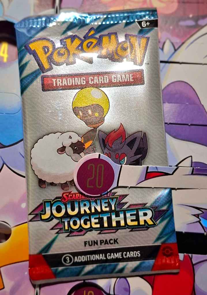
  • On day 20, we get a Journey Together fun pack!

    Our three cards today all share a similar composition! You may have heard of this compositional trick before: the rule of thirds. This is when you separate the canvas into a 3×3 grid, and there are many ways to utilize it depending on what you’re trying to portray. In these cards – Wailmer by Shinya Mizuno, Cramorant by Tomomi Ozaki and Iono’s Tadbulb by kurumitsu – the featured Pokémon is in the central grid square, making it the center of focus, but the other thirds are also utilized if you look closely! For Wailmer, the light beams are in the upper row and the coral are in the lower row, using the framing to position Wailmer in the oceanscape. Cramorant is similar, placing the horizon line of the water in the upper row, but the left and right sides have sweeping waves that curve inwards to draw the eye into the center. With Tadbulb, it may be less obvious, but take a close look at the buildings; the ones on the right have their edge line up with the left column, while the right column is marked by the shadow of a doorway. There are many compositional tricks artists use to help their artwork look a certain way, and understanding art is much easier when you’re aware of them!

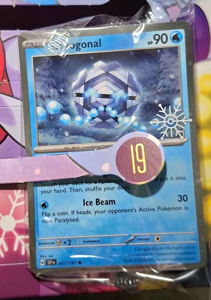
  • Today we have this Cryogonal card with the snowflake stamp! Originally from Surging Sparks, this card was illustrated by sui, who is known for their soft, painterly style that puts the Pokémon front and center. That’s on clear display here, with Cryogonal positively glowing against the backdrop of snow-covered trees with muted greys and blues creating a nightscape, while Cryogonal’s eyes and mouth burst with bright cyan. The contrast isn’t too harsh, thanks to sui’s softened outlines and bloom, which unifies the colour palette. Cryogonal is a very underrated Pokémon, but this card shows even it can look awesome!

  • Today we got this wonderful Vanillish illustration! Drawn by Taiga Kayama, this card was originally from Paradox Rift, though of course this version comes with the snowflake stamp. This artwork is wonderfully cartoony, with characters that almost resemble Miis, and the spectacular setting of a Vanillish-themed ice cream parlour! There are so many wonderful little details, like the Pokéball-shaped ice cream cone and the dessert shaped like a Pecha berry just underneath it; the Vanillish-shaped logo on the sign; the chalkboard in the background showing the menu; and almost certainly unintentional, but the energy icons for Frost Smash look like eyes on the cupcake behind them hehe. What a wonderful card!

  • Today we’re matching day 15’s Pikachu with the corresponding Eevee from 151, illustrated by Narumi Sato! Of course, it has the exclusive sparkle holo and snowflake stamp. I love how the highlights on this Eevee’s face and ears are stylized after the early card art and particularly Ken Sugimori’s original style; it’s fitting for a throwback set like 151! Little details like the flowers in the grass and pebbles on the dirt path bring life to what could have been a very simple artwork, giving it extra depth.

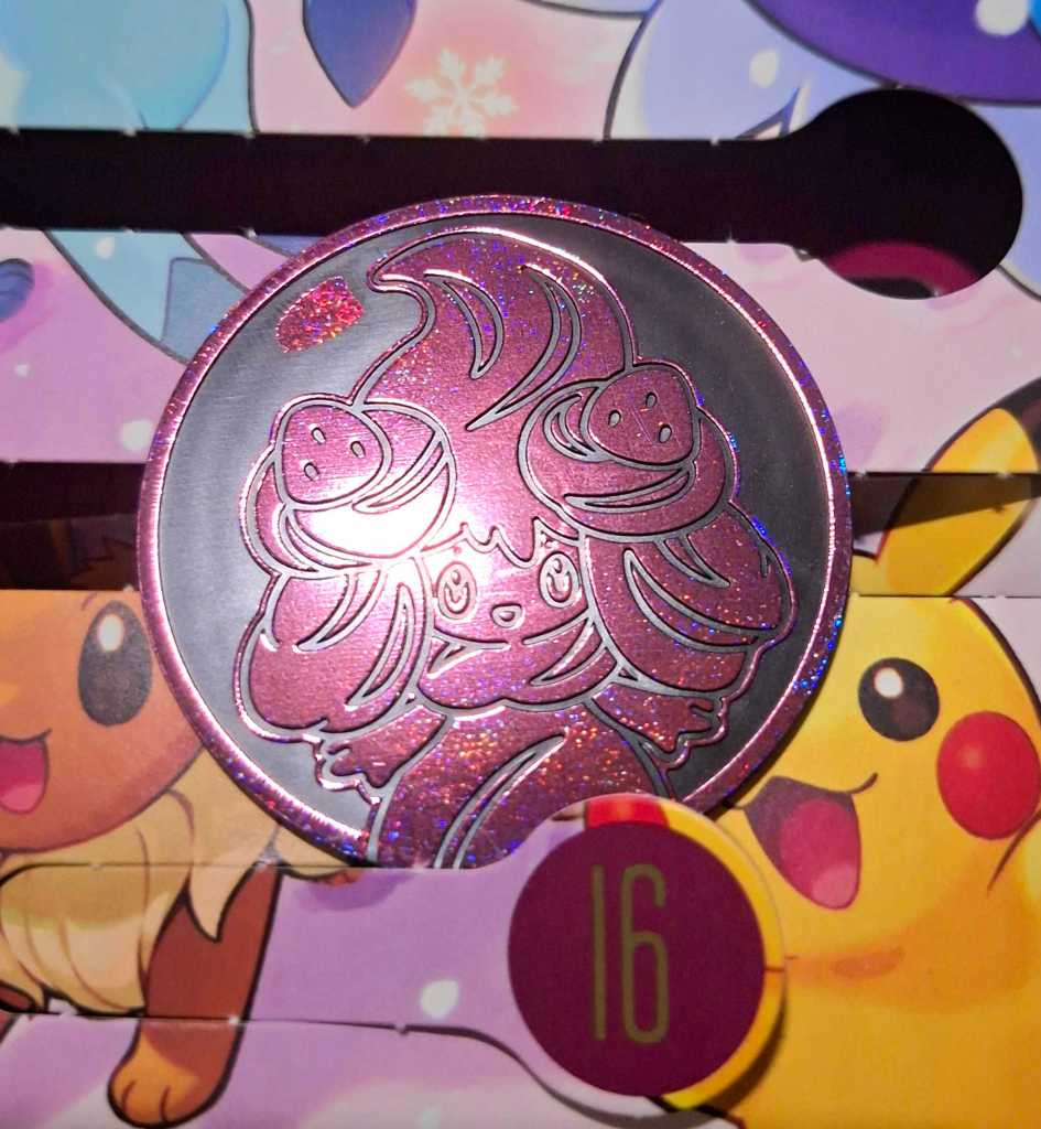
  • Today’s gift is this jumbo play coin featuring Alcremie! It was kind of hard to photograph with it being so sparkly and reflective, haha. I’m a little disappointed that mine seems to have a printing error with that extra patch of sparkle at the top, and it’s hard to see in the photo but there’s also a large white line above the right eye. Nevertheless, a cute addition to my collection!

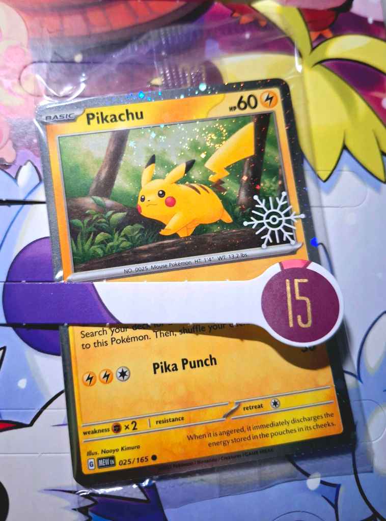
  • Today’s gift is a promo card! This Pikachu illustrated by Naoyo Kimura is originally from 151, but this version has sparkle holo and a snowflake stamp. There’s not much to say here; it’s just a very charming illustration! Pikachu stands out brightly against the browns and greens of the environment, and the leaning of the tree trunks helps with the sense of movement. Lovely!

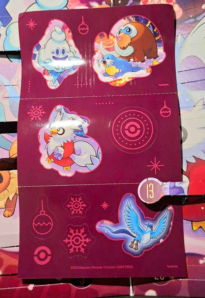
  • Another twofer today! The 13th’s gift was a second sticker sheet! This surprised me as last year’s calendar only had one sheet in my memory, but I appreciate getting stickers of more of the Pokémon featured in the calendar artwork! In this set, I particularly like the Mamoswine as he’s one of my favourites and doesn’t often get things like stickers.

    For the 14th, we got another Destined Rivals fun pack! Let’s see our three cards for today:

    From this set, I was struck by the Nosepass by Oku. Something about the setting felt very melancholy to me; a Nosepass stood in a barren, sandy plain, but happening upon a single yellow flower growing against the odds. The presence of the second Nosepass behind it suggests it may be part of a group, or travelling together. As Nosepass always face north, there would be a good chance of it missing this flower altogether if it was just a little to either side, but happenstance brought them together. I love cards that can infer a story like this!