So, let’s begin!
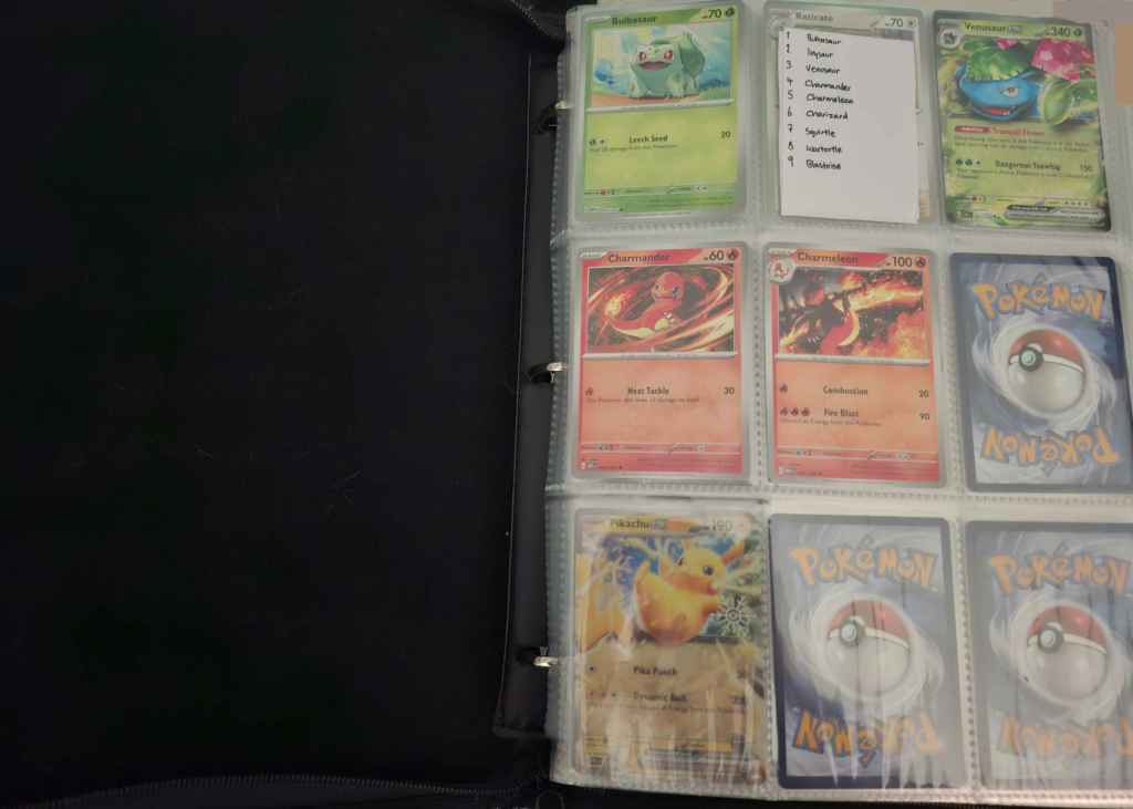
First things first, you need a binder, of course. The one I use has 9 slots to a page and came with 60 pages totaling 1080 slots – plenty of room for the current 1025 Pokémon, though there may be trouble when the next gen arrives. I think this is a great size to use for a Pokédex binder.
I also sleeve my cards, just for added protection, and for that I just use penny sleeves, which are the cheapest option.
And lastly, as you may be able to see in the above image, I made a set of index cards, each listing which 9 Pokémon should appear on each page. This helped immensely in the earlier days of collecting, when I couldn’t fill many slots and had to count meticulously to make sure nothing was being misplaced, and now it feels like a mini accomplishment when I get to remove one when I’ve filled that page. As far as I know the only option for these is to make your own, which is a bit of a time investment but definitely worth it.
So let’s take a look at the cards on this page!

First up is this delightful Bulbasaur from 151, in reverse holo. The artist for this card is Yuu Nishida, and I love the rays of sunlight beaming down and creating soft yellow highlights on Bulbasaur’s face. The low angle and minimal background leaves more room for the sky above, and the yellow and pink highlights on the clouds set the tone of the sun breaking through.
Next up, a Venusaur ex from Stellar Crown. Personally, I think ex artworks fall in a tough spot, typically having to pull close on a Pokémon’s dynamic pose and leaving little room for backgrounds or wide shots. With that in mind, I think Saki Hayashiro did a great job on this one, especially with the textures of Venusaur’s skin and petals, and its determined expression.


This Charmander from Obsidian Flames, illustrated by DOM, is extremely vibrant and dynamic with its swirl of luminous flames, but I’d like to point out the use of line weight here. In more shadowed areas, like the hand and foot, the linework is thicker and darker, while in the lighter areas like the face and back, it’s almost lineless. It’s a subtle detail that helps sell the weight of the movement and brightness of the lighting.
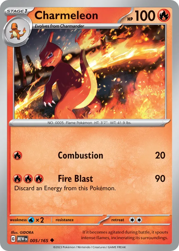
And finally for this page, Charmeleon from 151, illustrated by GIDORA. Despite being by a different artist and in a different set, I think it goes well together with the Charmander above! They share a dynamic swirl of fire and harsh lighting to highlight its brightness. This card has a more rendered style that helps show Charmeleon’s body shape in three dimensions, and the grey bounce lighting on its head and arm is a very nice touch that helps those shadowed areas stand out.

Leave a comment